By Kathryn Ayers Wickenhauser, DirectTrust Director of Marketing and Membership
As we kick off this new year, we’re proud to unveil the new logo, identity and visualization of DirectTrust as a result of our brand refresh. Read more below!
When I joined DirectTrust this past February, I was blown away. Having worked in healthcare compliance and regulation change (à la Meaningful Use), I was familiar with Direct Secure Messaging, and knew a bit about DirectTrust before I joined the team. What I found was a strong membership organization with passionate members, devoting their precious, in-demand time to advance one particular goal: the secure and trusted exchange of health information so that we – patients, providers, support staff – may benefit from an improved health ecosystem.
What I’ve discovered over nearly the past year has inspired me and gives me hope. When interoperability and methods like Direct Secure Messaging were introduced to me in 2012, honestly it seemed a bit out of reach. How could an organization drive so much change in healthcare communication so quickly? Yet, here we are today, with over a billion messages sent and received and I can confidently say Direct Secure Messaging is working and is improving healthcare.
While we’ve seen so much growth over the past year, as we embark on a new decade, there is still so much more to do.
When I spoke with members about how we could continue to elevate a strong identity and push interoperability to the next level, improving our communication about who we are as an organization and developing educational materials about Direct Secure Messaging seemed to rise to the top. Discussions with peers in healthcare confirmed our membership feedback. One of the unique challenges of DirectTrust is that while you’ll find the ability to send a Direct Secure Message through most EHRs, the majority of the time, you won’t see the DirectTrust name next to the feature, leading to confusion about who we are and what we do in the industry.
Ultimately, we (DirectTrust Board and Staff, Membership, Workgroup participants) decided it was time to reacquaint the industry with who we are, and we set off on an adventure to outline what we want others to know about us.
Today, we are proud to unveil our new brand identity and visualization.
Make no mistake, while our look may be changing, DirectTrust is still committed to the same core principles on which were founded in 2012. While there are more exciting changes to come (hello, new website!), this is the first step in an exciting process to reintroduce ourselves and the power of our collaborative membership organization to inspire true change in healthcare.
The Process
After thorough evaluations were completed inside and outside of our community, the information gathered solidified that a refresh was necessary to align our external reputation with our visual and written representation.
The Marketing and Membership Workgroup provided a primary collaborative to gather ideas and criteria for our updated look and feel. Expectations for the logo included:
- Color green to represent trust and credibility
- Something to tie to identity and the importance of verification
- Easy to discern, especially when reduced in size
- Able to be horizontal or stacked
- Able to become a secondary logo for Accreditation and other purposes
For color scheme, the group wanted to see fresh and modern colors, without losing sight of who we are. Additionally, fonts were modernized with for ease of reading.
A small selection group reviewed over 100 logo possibilities, multiple color scheme options, and differing fonts, all of which have led us to our refreshed look.
Our Updated Brand Identity and Visualization
Without further ado, introducing the new logo of DirectTrust!
![]()
The primary mark of the logo includes a shield, suggesting security, credibility, and guardianship. Within the shield is the outline of a person to represent identity verification, as well as the members who make up DirectTrust. A green checkmark rounds out the shield’s outline to convey verification and trust. The name of the organization accompanies the logo illustration, highlighting the key differentiator of the organization, trust, in green. The sans serif font conveys stability and thoughtfulness.
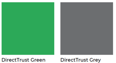
The new color palette is reminiscent of the established DirectTrust brand with a refreshed Kelly green, while offering a balancing gray as a new primary color of the brand. The DirectTrust green conveys growth, possibility, progression, while also expressing confidence and trustworthiness. The gray balances the brightness of the green, offering a steadfast, mature, and thoughtful complement to illustrate DirectTrust’s commitment to standards, consensus, and process.
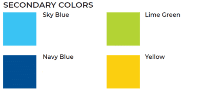
The secondary palette features fresh and contemporary colors to be used as accents to exemplify DirectTrust’s relevance in the here and now, as well as a strong commitment to the future of interoperability. The sky blue is approachable and inspiring, complemented by the assuring and trustworthy navy. The ancillary secondary colors of lime green and yellow instill a feeling of harmony, curiosity, vitality, and excitement.
Celebrating Who We Are
In a way, this brand refresh is a celebration of our volunteers and members. So much energy and commitment has been invested into this organization, even prior to our official founding in 2012. Updating our look and feel is a tribute to the solid foundation they’ve created for us, a foundation on which we intend to continue to build upon to be prevalent and pioneering well into the future.
2020, here we come!
—
We’re so excited to share the new brand identity and visualization with you! Let us know what you think by engaging with us on Social Media on Twitter @DirectTrustOrg or on LinkedIn by tagging @DirectTrust.
If you’re interested in understanding more about our process and where we landed, reach out to me at [email protected].